Simple Imagery Peril & Presence
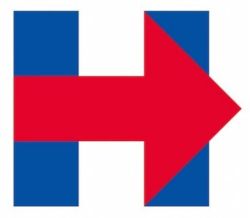
One of the American news networks conducted a forensic examination of Hillary Clinton’s current Presidential campaign logo.
Perhaps inspired by this good ‘designer daily‘ summary.
Whatever your left/right lean, the adopted capital H with arrow is indeed simple. although often a winning template, it’s just too simple here, isn’t it. It does not smack of design literacy. Doesn’t stay in the mind. Doesn’t, well, impress.
Quoted criticism includes “unbalanced” and “lifeless”. Mind you, the font created of the logo is a wonder (should that be called Hillary Bold or Hillvetica?).
Then again the web contest cited doesn’t seem to inspire the pros either…
I often find myself trying to get salespeople to draw.
That skill we reveled in as little ones. Yet now scares most elders into jittery silence.
One example is thinking up a ‘deal logo’.
A small marque that help i.d. what we’re about, from the prospect perspective, that can help as a visual pause tag in a slidedeck. A marker still visible when talking around and about elsewhere.
Ideas (eventually) do flow. Even with those for whom crayons are a distant, forgotten memory.
Naturally, The Hillary Pitch got the internet treatment.
One in particular is gold, “Hillary campaign blames Bush for …” you know what;
A quick browse of all this design effort and you can start to think how you’d conjure something perhaps along similar lines.
It needn’t be of world-leading creative calibre. It simply needs to start to set you apart and get your buyers thinking.


