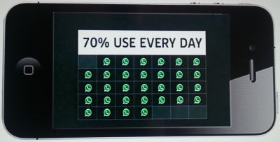
Skynews WhatsApp Graphic Fail
Ooops.
With the airwaves and cyberspace pulsing with the ridiculous $19 Billion Facebook purchase of (the delightful) WhatsApp, here’s one of the key graphics from the report on London’s rolling news channel, Sky News.
They use the commonplace frame of a smartphone (you can find several such templates to copy into powerpoint around the web).
They make neat use of the whatsapp logo/icon, as well as trying to avoid the dull pie-chart with a more modern infographic block.
But wait.
…and their maths?
The headline (along with accompanying narration) states that 70% of whatsapp users message on it every day.
Yet the graph shows that nearly 90% do so.
They have a 7 by 5 grid. That makes 35 cells. Only 4 are empty.
31 out of 35 is obviously not the same as seven out of ten.
That would be 24½. That would have been easy to display. And the cutting of a single logo in half may have even added to the image.
This style of data depiction is a winner. Just make sure your maths isn’t Grade F.

