Slide Stamp Of Retrieval
There's a hullabaloo where I am about a mail change.
The story behind the English invention of the modern day postal service is a cracker for students of pricing policies.
The global postal system as we know it today was the brainchild of an English 'schoolmaster turned social reformer, [with] no official standing'.
Upholding a long line of English 'Enlightenment' style disruptors with no formal connection to the field they duly up-ended for the better.
The system in place was in disarray. Open to mass misuse, complex charges and the receiver bearing the costs, it was ripe for redesign.
Step forth Rowland Hill. His radical change rapidly became the blueprint worldwide.
He proposed a flat rate of a penny, by way of a 'stamp' bought upfront by the sender.
It proved genius. Its 1840 implementation led to a revolution in communications akin to our latter day adoption of phones and web. By the end of the first year mail doubled. A decade on, it'd doubled again.
All from the humble penny. Quite the supply/demand price curve action to mull.
The latest innovation appears sacrilegious.
The game-changers have now gone for the stamp.
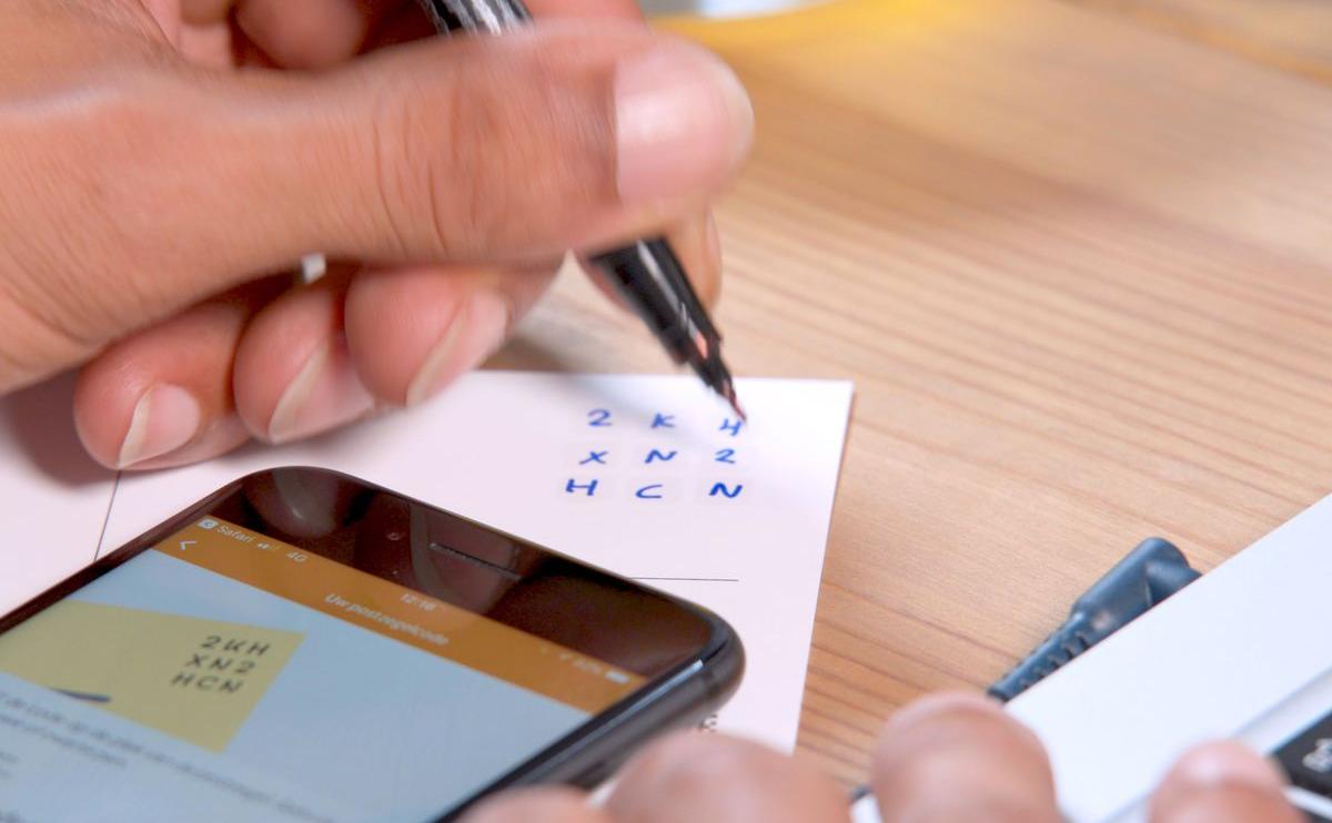
Postal services - such as the Dutch in the pic up top - are swapping out the old faithful stickable. For a mere computer-generated code. Handwritten where stamp once sat.
There's a clear presentation link for us here.
I've long railed against the insistence of corporate, marketing mandated style guides for reducing available screen space; by having to slap some kind of precious branding on your slide.
Wherever it resides, usually a corner but too often practically a banner, it is a total waste.
My favourite - beyond the blank canvas - is for chart or diagram imagery which evokes the theme of your deck.
De-'data-inked', miniaturised, coloured accordingly.
If you must have something acting as a branding theme running through your deck, then this is the visual to drop in.
Either from data or intel around problem seeking solution, or the direction you're hopefully headed together.
This snail mail vibe though gives us another option.
The code.
The 3x3 alphanumeric Dutch stamping is a cracker of a template.
Think where you've a trio of destinations. Each may have its own recognisable initial letter identifier. With maybe two significant figures happily sitting alongside for each.
The combinations are manifold.
Consider how your audience might recall at a later stage the logo you were forced to paste top-right. How did that help your message stick? Compare with switching that up by putting in such a postal code neatly summing up your thrust in its place.