Spring Statement News Site Splash InfoDoc

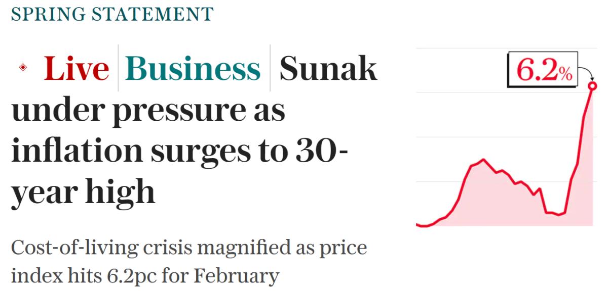
The above screenshot is from a London broadsheet website. In the run-up to a major annual event later that day in Westminster. The Chancellor's Spring Statement.
The Telegraph splash atop their homepage's container resembles our landscape slide dimensions.
As it stands, this is a useful guide for a so-called 'infodoc' template. A message to send when you're not there. Or a takeaway summary for after you've spoken.
If in-person, there's opportunity for a neat piece of 'progressive disclosure' here.
Adopting the theatrics which leads to better stickiness and higher recall.
You'd start say, with the graph. Shown only to the trough. Then reveal the hickey-stick leap. Finally adding on the number for maximum hit.
No need to show the accompanying text.
Yet if sending a single digital image, you can use this format to make your point.
A couple of tweaks though in our arena. Enlarge the graph. Move the capitalised title (delete it, even). And would our number label really need that little curved arrow?
This technique also shines in a specific sales setting. Where we're discussing with our allies a key point of differentiation, urgency or appeal.
When trying to refine and define it. This kind of presentation helps ensure we're on the same page and have accuracy on our side. With collaboration of the back and forth covering both the feeling and the fact in our favour.
