Urbanista Room Dressing
I’ve blogged on this vital skill before.
Theatre stage designers can teach sellers a great deal.
Not in terms of trap doors, no matter attractive one may often be, nor smoke and mirrors to add pizzazz to a presentation.
Which to slightly digress, reminds me to adapt the lovely quote about design attributed to Juan-Carlos Fernandez;
bad selling is smoke while good selling is a mirror.
Which gets me thinking also about art gallery layouts. How an installation is deliberately displayed to make the most of the experience of being there.
There is on occasion a key meeting you’re hosting where you know the precise venue in advance, have prior access to it and so should try – although it is a hard task to pull off – to ‘dress the room’ in readiness.
So I did like to see a noble movement do just this. Taking the bohemian route, they announced plans for a city centre rehabilitation from an unused building in their focal point location as their launch pad.
They dressed the room beforehand.
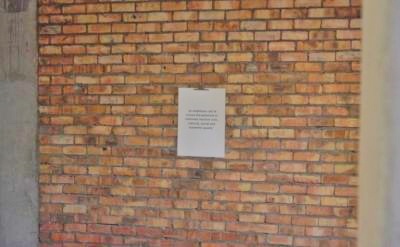
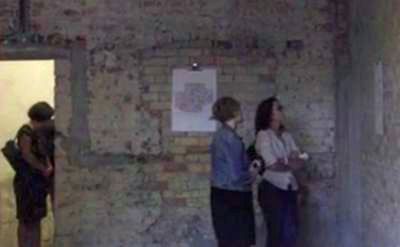
The top ‘n tail pics are from the event. Some of several bare bricked, half-plastered walls adorned with single sheet of paper.
The one above being a kind of version of their ultimate “success statement”. Other walls had similar laminated pages with bulldog-clip hung on them. They included graphics, plans, lists and details. All in between artefacts on floors and tables supporting their cause.
Think of every meeting room you go into. Same faceless four walls. Maybe these days a glass panel here, huge plasma there. Cabinet where the tea and coffee perch. Selection of nearly spent marker pens in a drawer.
Now imagine that room with prepared decoration.
A key graph printed in striking colours pinned to a board and stuck at head height.
Some simple circles with words in them, connected or dotted lines making a flow in thick pen on a flipchart sheet taped up next to the drinks.
A list of priorities printed out, ready to be ranked.
The standard 2×2 matrix template primed for action.
A photo blown up large which, despite being perhaps a touch blurry or pixelated still gives impression of the problem seeking resolution.
The options are almost limitless.
I’m reminded of the anti-forgery trouncing of mechanical reproduction back in the Thirties. The impact is something you cannot replicate sending through a mere jpeg or pdf. In the term of those bauhaus and art deco days, your room gains a precious aura. One your competition will lack, and your prospect will likely prize.


